Have you ever entered a space and been immediately overcome with peace, energy, or warmth? And guess what? It's not just magic, but the beauty of colours at work. In this post, we'll examine how to use the magical colour palette to create the ideal ambience in any space.
From peaceful blues to vivid reds, we've got all the details on how to use the colour spectrum to create moods which suit your mood and style. So get ready to discover the secrets of colour alchemy and change your rooms into mesmerising havens of ambience.
What Is Colour Psychology?
Aside from purchasing a new car or updating a room, we rarely give much thought to the colours in our everyday surroundings. However, colour and the psychology of colour make it important for us to navigate the world at work, play, or just while soaking in our surroundings.
It has been found that some colours have the ability to alter our emotions, thoughts, and behaviours. Without using words, colour is the silent communicator that can convey our feelings.
Hormones are released when colour is conveyed from the eye to the brain, and these hormones can either have a favourable or negative impact on our emotions. Additionally, our behaviour is primarily influenced by our feelings.
Various Effects Of Each Colour
The colours you select to surround yourself with greatly influence how you feel in a location. Warm and colder tones evoke extremely diverse moods, and colour choice can significantly impact a space's ambience.
Not only should the colour be taken into account, but also any subtle undertones and the colours that will be used as either painted surfaces or accents in the room.
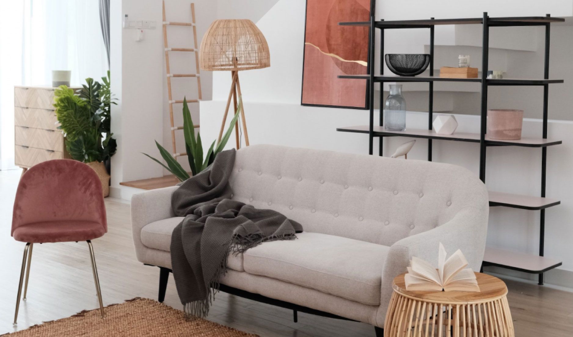
Red
Red is a striking colour that will attract some attention. It represents the following qualities:
- Energy
- Actio
- Vigour
- Passion
Additionally, it symbolises love and desire. It can be too much to handle as the dominant colour in a space. However, it makes a terrific statement as an accent colour, like a single sofa chair or living sofa.
Since red is never dull, it works best in lively spaces like the living room and other common gathering places in the home. It could be more challenging for folks to remain calm if it's in a calm atmosphere. But some people incorporate red in bedroom designs if they want a romantic feel.
Red can occasionally stimulate hunger. As a result, it's frequently used in restaurants and fast food logos. Consequently, you might want to consider incorporating it in your kitchen.
Yellow
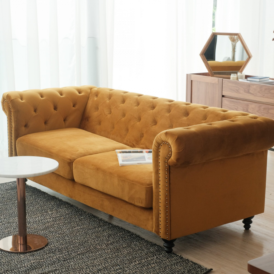
The colour yellow is linked to joy and happiness. In interior design, it can be too vibrant and overpowering, but pastel variations or subtle yellow accents can add interest. In general, the colour yellow represents the following:
- Intelligence
- Joy
- Optimism
Its vividness also gives people a boost of energy. Similar to other warm colours, yellow looks best when used sparingly in interior design.
Yellow accents, such as a living sofa or single sofa chair, can add an intriguing contrast. Rooms intended more for social events than relaxation are the best places to use yellow in.
Green
In terms of design, green is one of the most adaptable colours. Light green is a good choice if you want bright, intense colours. Dark green or blue-green can be used if you want something more relaxing. In general, the colour green represents some qualities like:
- Growth
- Peace
- Safety
- Good health
Green can be used in almost any space, depending on the complementary colours you choose. Darker shades of green can be used in peaceful spaces like bathrooms and bedrooms. When used sparingly as subtle pops of colour here and there, more vivid greens might look good in the main spaces.
Blue
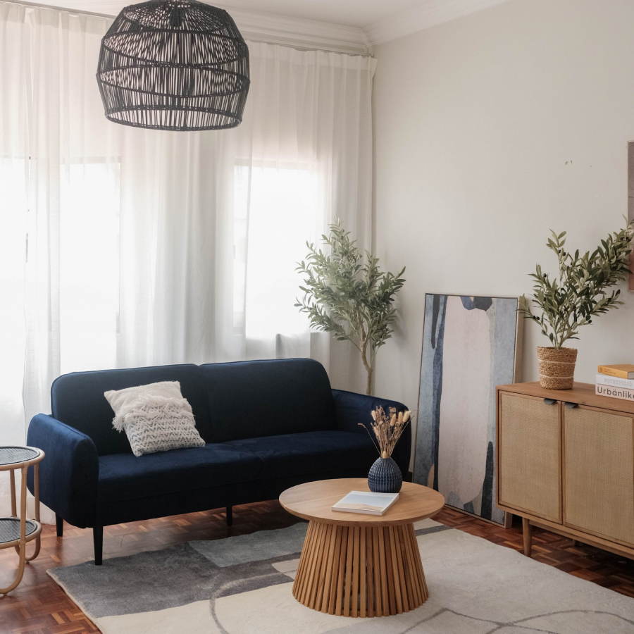
Blue, one of the most powerful colours in the colour psychology spectrum, is thought to lower blood pressure and regulate respiration and heart rate. Deep, strong colours have a reassuring impression and are associated with qualities like:
- Success
- Trust
- Peace
- Loyalty
This colour is frequently recommended for bedrooms and bathrooms where you want to establish a soothing ambience because it is calming and peaceful.
Purple
Purple is associated with a variety of good emotions, including:
- Depth
- Creativity
- Fantasy
- Nobility
It exudes a regal allure and a sense of elegance, giving off an authentic presence. For best results, use it in a dressing room. Alternatively, showcase it in your entryway to impress visitors instantaneously.
Pink
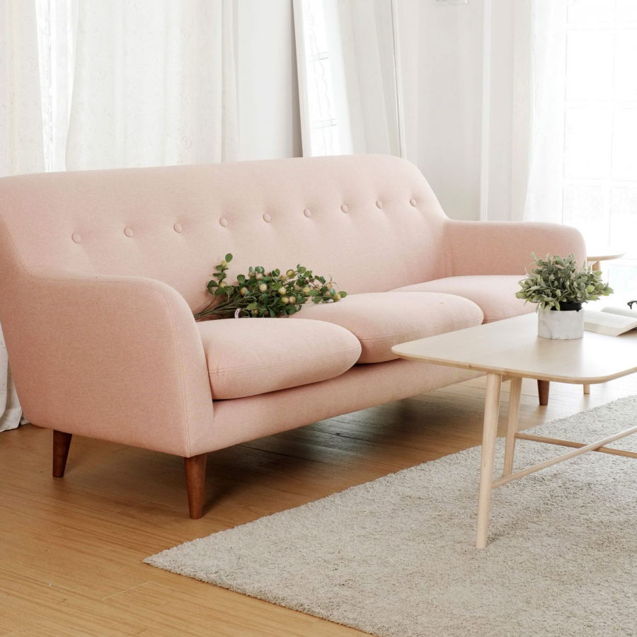
Pink is frequently associated with femininity. However, it has far more purposes than just that. It also stands for love, joy, and compassion. Since it is one of the most noticeable colours, it is frequently used in settings where the goal is to stimulate excitement.
Pink is uncommon in homes. If used, it's typically in a pastel variation or simply as occasional splashes of colour. Given that it promotes play and creativity, it can be used in any of the following rooms:
- Playroom
- Sunroom
- Art studio
White
Since it complements almost anything, white is a fantastic colour for interior design.
The majority of room designs incorporate some white, but too much white can be monotonous. When used properly, white can symbolise the following:
- Perfection
- Cleanliness
- Purity
- Innocence
White can be used in any area of your home, especially in functional spaces like the bathroom. Make sure to incorporate colours other than white wherever you use it. Pair it with various colours to avoid having guests get tired by the simple décor.
Black
Black should be used less frequently in comparison to white, which can be utilised liberally in any space. The atmosphere of the room becomes darker than planned because it sticks out and can easily dominate other colours. Black represents safety, power, grandeur, and sophistication.
In interior design, black is a contemporary, bold, and trendy colour. However, if used excessively, it can come off as gloomy. Therefore, use it in furniture that will complement the other decor in the space rather than painting your walls with it.
Black doesn't work well in spaces with a lot of activity and excitement because it is such a dark colour. It is ideal for areas where people would sleep or relax, such as a bedroom or theatre room, because those locations are generally dark.
Brown
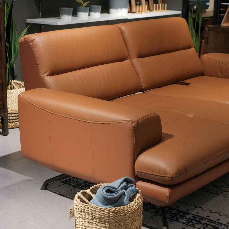
Due to its neutral hue, brown is another colour that is frequently used in designs. It represents qualities like:
- Trustworthiness
- Stability
- Honesty
- Comfort
As a result, it's a safe, inviting colour to use in interior design. We are familiar with brown since it appears frequently in nature. When used in interior design, it can create a serene, rustic atmosphere in a room.
If you want people to be productive in a room, don't use brown unless you plan to pair it with energising colours because brown makes people feel relaxed.
Understanding Colours Can Help Your To Create The Ideal Atmosphere In A Space
By selecting furniture colours that reflect your intended ambience and design, you are establishing an experience rather than just decorating. Therefore, let your creativity run free and allow the right furniture colours to give life to your interiors.
At Ruma Home, you can find the ideal living sofa chair for your house!
Visit Ruma Home to get the best living sofa in Malaysia at an affordable price to furnish your living space.
Our internal design teams have ensured that you'll adore the items that are suitable for every home. Additionally, if you look at our living sofa through the eyes of a qualified interior designer, you'll notice its excellent quality and design features! Visit our showroom now!
